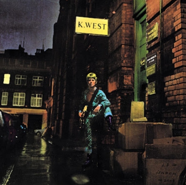
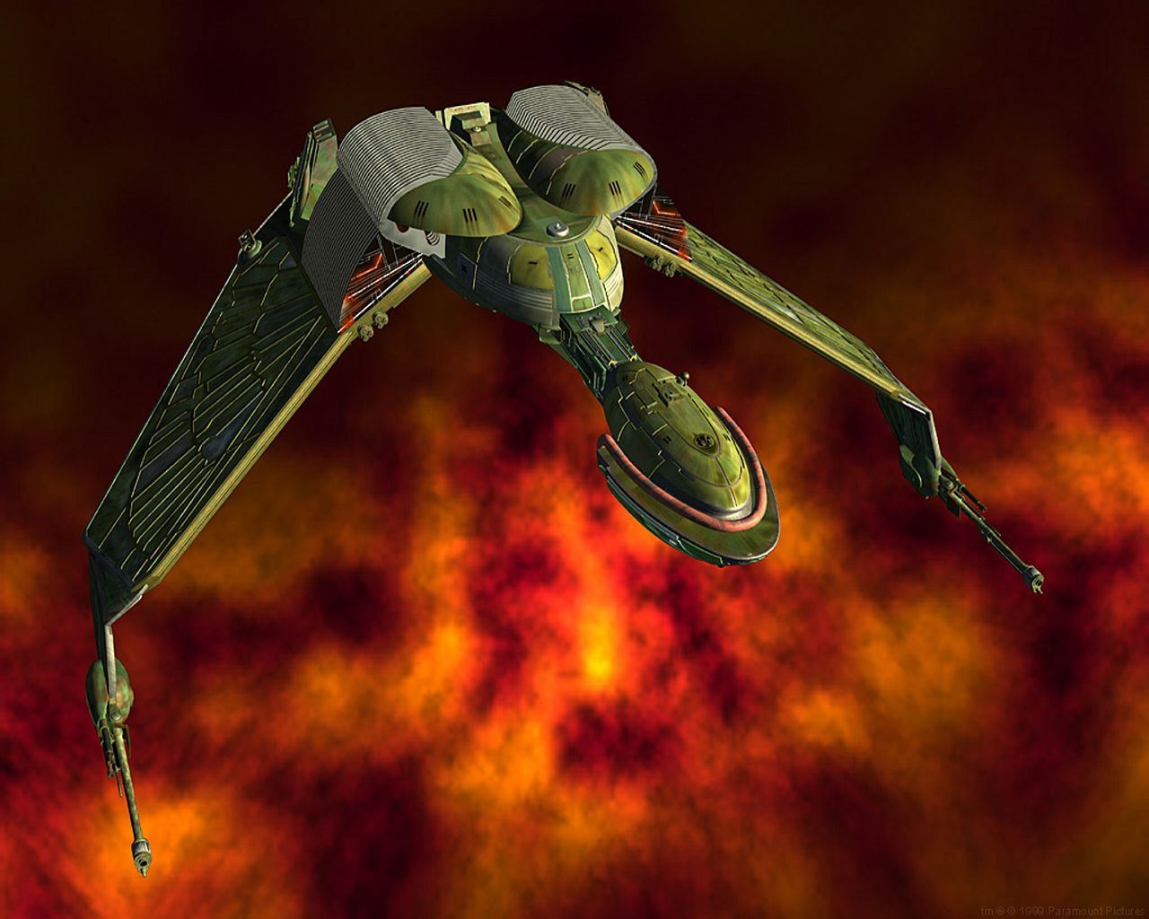
A picture of Lara Croft in new Tomb Raider hand in hand with Lara Croft from the old Tomb raider Series. The new one labeled GNOME and the old one KDE.
And other memes made by people who have never used KDE.
i think is reversed… but it’s ok
Have you ever used either?
To say they’re reversed is pushing it as I’m not sure gnome is at the level of the low poly lara yet
I used Gnome for years and can honestly say that if you put a lot of effort into it, mess with configs, and install a few extras, it rises to a new level of kind of shitty but usable.
Fuck, KDE was pretty a decade ago, and Gnome is still just plugging away, being the bare minimum.
One thing I’ll give gnome, it’s really good for 2-in-1s. The desktop metaphor works really well for tablet and trackpad use out of the box.
deleted by creator
Everyone here is super salty, meanwhile I just thought this was suggesting that GNOME is like a rounder KDE
Used both. Dislike both. Now on i3.
Same, but I ended on Hyprland
Used i3 for years, tried bspwm. Liked the concept - absolutely loathed the community. Ended on herbstluftwm.
If Wayland ever fixes hdpi scaling, I’ll be looking for something that works the same way: configuration is entirely through scripting, not config files. I don’t think I’ll ever give that up, now that I’ve discovered it.
It looks like hyprland uses config files, right?
Arch btw?
EndeavourOS, formerly pure Arch btw.
Pure terminal, GUI is for noobs 🤣
I feel like this is used either by someone who hasn’t used KDE in a decade or has been using Linux (Ubuntu) for less than a year.
The worst thing you can say about KDE is that the default configuration is pretty basic. However, that’s arguably a good thing because that format is straight up better for productivity.
KDE has also embraced user choice. Not only do they design the desktop and applications to be much more configurable than GNOME. A power user can customize KDE in a way that seems to personally offend GNOME developers. In addition, KDE 5 designed their libraries in a way that other DEs can leverage them while still doing their own thing. I haven’t kept up, but at one point that was a huge boon to LxQT development.
Above all else, the KDE team seems a lot more reasonable than the GNOME team. Over the past decade, KDE has worked hard to rebuild trust after their disastrous 4.0 rollout. Meanwhile in that same period four different groups of developers have decided to go their own way because they felt the GNOME team was impossible to work with.
XFCE just chillin in the background
You get a like for the meme from me, but I can’t see how this is remotely true… KDE user here… KDE user for a reason…
Gnome reminds me of MacOS(derogatory). I mean at least Gnome lets me change shit if I fidget and fennagle enough, but it is still far too locked down for me. Extensions are a half-measure that also doesn’t do enough.
KDE is good but it’s a bit pudgy, I’m a XFCE user.
Gnome has felt a lot like the Fisher Price DE lately
Gnome feels stale… i cant describe it better but when using it it feels like im 20 years older.
Kde feels more modern but customizeing it is a pain in the ass for me
Window managers it is!
XFCE is better than both.
Good joke
XCFE feels like it came from that XP/Vista period where UIs were moving away from looking like they were drawn in a terminal but hadn’t quite reached “fluidity” or whatever other bs marketers call modern UIs… I could understand a tiling dm being called better than both but given XCFE is only better at being lightweight, that’s a self-placed restriction because it’s very reasonable to say most people can run either KDE or Gnome with virtually undetectable overhead
Xfce is highly customizable (definitely more than gnome) and can look modern with a little theming. Its also much easier to replace components of the de (like the xfce wm or app launcher for example)
I’m sure you could make it look like whatever your head meat blob can come up with, but eventually you’re five hours deep in a rabbit hole nobody has ever gone down and uncovering software bugs that god himself didn’t know about, just trying to make the damn thing usable.
On GNOME, I don’t have to worry about any of that - the OOTB experience is just fine. For anyone.
Wat? Not sure what is the creator smoking buthe/she should seek help.


