- 9 Posts
- 53 Comments
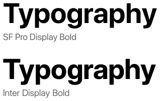
+1 for Inter. Kind of reminds me of San Francisco :)
🟨 preview: Inter
Protomolecule everywhere? 0.o
Scifi fonts remind me of old Rainmeter configurations. Wonder if Rainmeter ricing is still around
🟨 preview: Protomolecule

I agree! Nice memories of hitting backspace in a Linux Mint terminal and hearing that weird-ass BWOUP sound.
I recommend Ubuntu Mono for Termux users. Look at this black-background beauty – way better than the angly flat default

Anyone using Nimbus Sans?
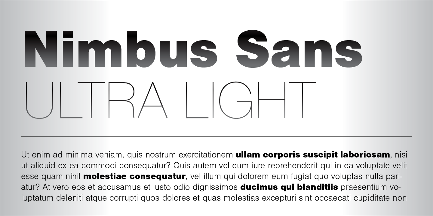
It’s actually preinstalled in a lot of systems. You can check via
gnome-font-viewerorfind /usr/share/fonts -name "*Nimbus*"
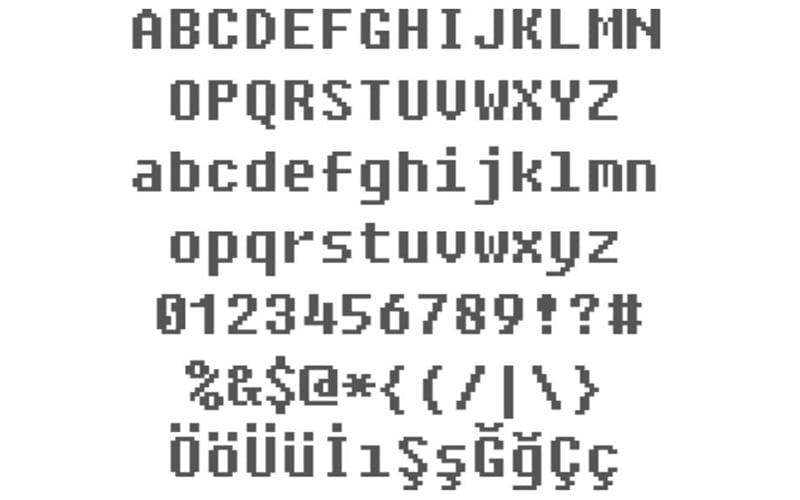
Interesting. What makes you use bitmaps as a system font?
Gohu:

I get it for TTYs. Though for TTYs nothing will take me away from Terminus :]
Ohh, that’s what that 8bit-y font is called.
…wait. Why would you use 8bit as a system font???
🟨 preview: Fixedsys
I read through the website, and it feels… odd.
Is this font’s only purpose to be variable-width tunable?
The website has this interesting showcase:
“[Student fluency] is measured in Words Correct Per Minute… Each student read out loud a passage set in a control of Times New Roman, then four of the Lexend Series — Deca, Exa, Giga, and Mega.”
They even give example text for the viewer in both fonts. Of course, Times New Roman was blown out of the water, and the viewer can feel it.
But… this is apples to oranges. Of course the viewer can feel it, Times New Roman is a freakin’ serif, and there are a quinquagintillion sans serifs for small digital text, for good reason! Then what does this font have over other sans fonts? I couldn’t find the “Stanford study” or any other comparisons, but if I were to surmise a guess:
“Variable font technology allows for continuous selection of the Lexend Series to find the specific setting for an individual student.”
It’s to be able to adapt for a student reader’s preferences.
I dunno, the site’s framing of “changing the way the world reads” feels disingenuous – it’s a nice sans tho.
Why were you downvoted? Cartograph CF is rather pretty - its italics aren’t so bad either. But Victor Mono’s cursive comments… yeesh
🟨 preview: Cartograph CF

🟨 preview: Victor Mono
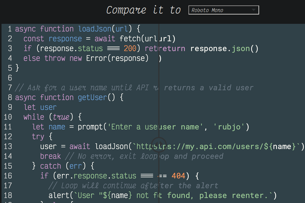
An independent open source font, interesting. Looks pretty too, especially for multiple colors
🟨 preview: Maple Mono
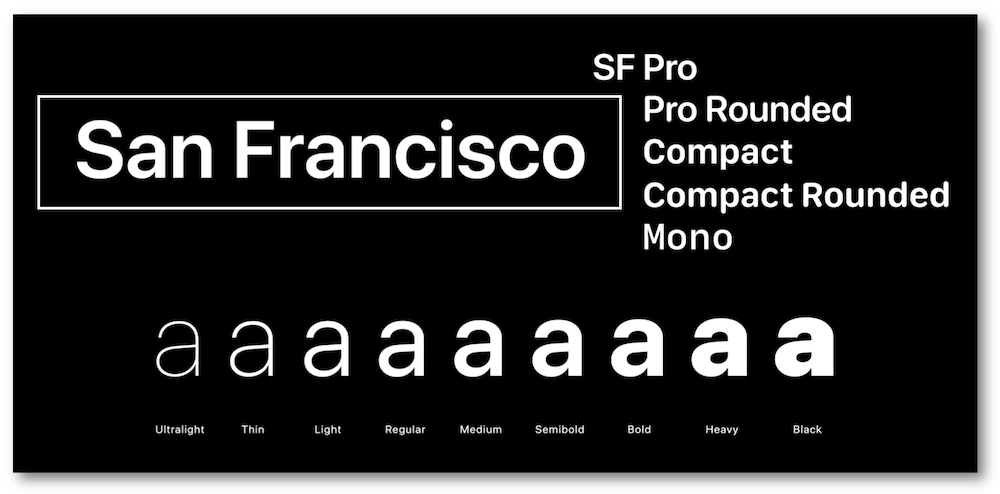
There are a lot of San Francisco fonts. Have you tried all of them? :p
🟨 preview: SF Pro display

🟨 preview: Other SF fonts
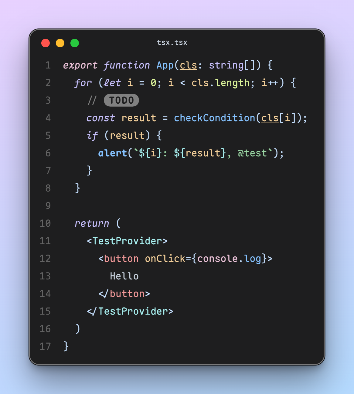
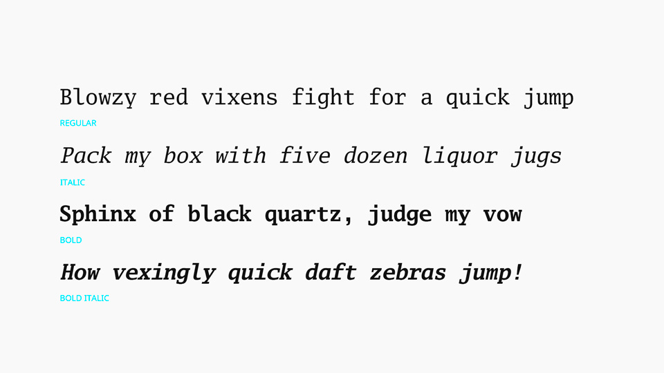
By proportional slab serif do you mean unmonospacing the monospace like what Ubuntu does? I guess that’s why Go Proportional wouldn’t work being a sans serif
🟨 Preview: Go Mono

 10·5 days ago
Man, I have a minor inconvenience.
installs Gentoo

 9·8 days ago
I’m not sure I understand the question
If you’re looking for a “something is two opposites at once until met” then that’s anywhere any unsureness exists. Lesson plans are decent and lacking until taught to students. Visual art is pretty and dismal until witnessed by another beholder. Speeches are rousing and dogshit til spoken at the mic.
If you’re looking for a “something that’s explained oversimplifiedly then a lot of people say they get it (and are wrong)” then that’s like a subset of all misconceptions.
- Monads in programming. Lots of people say they “get it” after a simplified explanation, but actually don’t get it (judging by blog posts that recite a simplified explanation, but actually don’t get it).
- Tariffs. Lots of people learn middle school mercantilism (zero sum wealth) then guess that the economy is still import export balance, and that if we make people exporting to us more expensive then we get more of the zero sum pie. (Obviously wrong, and a basic macroeconomic lesson on consumer welfare in a system with a world price is useful)
- A lot of physics terms tbh. “I get momentum, that’s when it’s hard to stop when you’re fast.” Often they mean something closer to inertia. “I get the Heisenberg Uncertainty Principle. It’s when seeing something changes it!” It’s closer to uncertainty in the measurement of tiny things because of the physical implication of what we measure it using. (e.g. by reading a photon off of something, we know we’re kinda inaccurate cuz the photon was discharged)

 10·9 days ago
Yeah… it’s hard.
The status quo, even if its dredged from a lake, is so comfortably uncomfortable. You resolve to change, but do futilities. You resolve to change, but your leg is caught and you return by week two (aka the New Years’ Resolutions number).
And to leap out and be instantly different is to play as something that doesn’t have the safe façade of being a system gear. Then you’re an oxbow lake, rather than in the river, and you wonder if everyone else is “floating by” already while you erode the soil that kept you streamlined down the main.
And then comes the “Should I have stayed? Was I being arrogant, spoilt enough to give up what I had?”
Idk what the moral of my comment is. I don’t want to say “I’ll discover it in a few years” either (,>ࡇ<,). Hopefully the mystery box is truer to my self than the alternative

 29·9 days ago
The grind culture is such an alluring chopping block. A meat grinder… some people go in, apply for a thousand internships, work three jobs, but not all of them go out. Is it a weak vs. strong separator? Am I weak?
I hope not. I’m just an archer, not a tank, I’d like to think.
I’m sorry your dad still has to work, and about their injuries.

 16·9 days ago
Word. All of these efficiencies and inefficiencies… humanness is distinct from it
It’s hard to come to terms with sometimes. Looking at a staff with 3 bars, or a short riff, then thinking man, did I review my finances for the month? But the time isn’t wasted. The pastime isn’t a reward. It’s as important as the work.
But you don’t have to be a monk to balance again :)

 18·9 days ago
Premises:
- My family watches the news for [weather] and [ye local murder].
- My friend says: his dad says: “the news lies.”
- Parents are trustworthy, and cops can’t lie to the news.
Conclusion:
They lie about the WEATHER!?

 9·9 days ago
Thank you for this. This comment is just a little push but now I see – I’ve already forgotten how long I’d gone without writing a note onto a staff. How long I’ve spent on just “things that will pay me or pay off.”
I will do this immediately.

 5·9 days ago
interrobang spotted


just use
-flol.less $(which zcat)shows us agzipwrapper. So we look throughgzipoptions and see:party music