u/CleoMenemezis explained a little better on the Reddit thread about it, but a tl;dr is:
The corners are currently drawn on CPU and it is slow, and the way it’s implemented is hacky, which could cause artifacts and made impossible to be used with themes.
Hmm, interesting. I can definitely go along with their reasoning, but I do wonder how much the aesthetic will change.
I feel like those silly little corners do rather much to differentiate it from Xfce and MATE.
I also wonder what those corners will look like when a window is maximized. Does the window fill out the corners, or do they turn those corners black in another way, or does it simply show the wallpaper in those few pixels?
I do wonder how much the aesthetic will change.
I can really talk about the aesthetic changes due to using the shell-theme-upstream “theme”, which now gives the option to have or not the rounded corners. It looks weird at first, specially after years of being used to having one, but we’ll get used to it. It’s not a make-or-break thing for the desktop.
To be honest it just looks a bit more like macOS now.
I also wonder what those corners will look like when a window is maximized
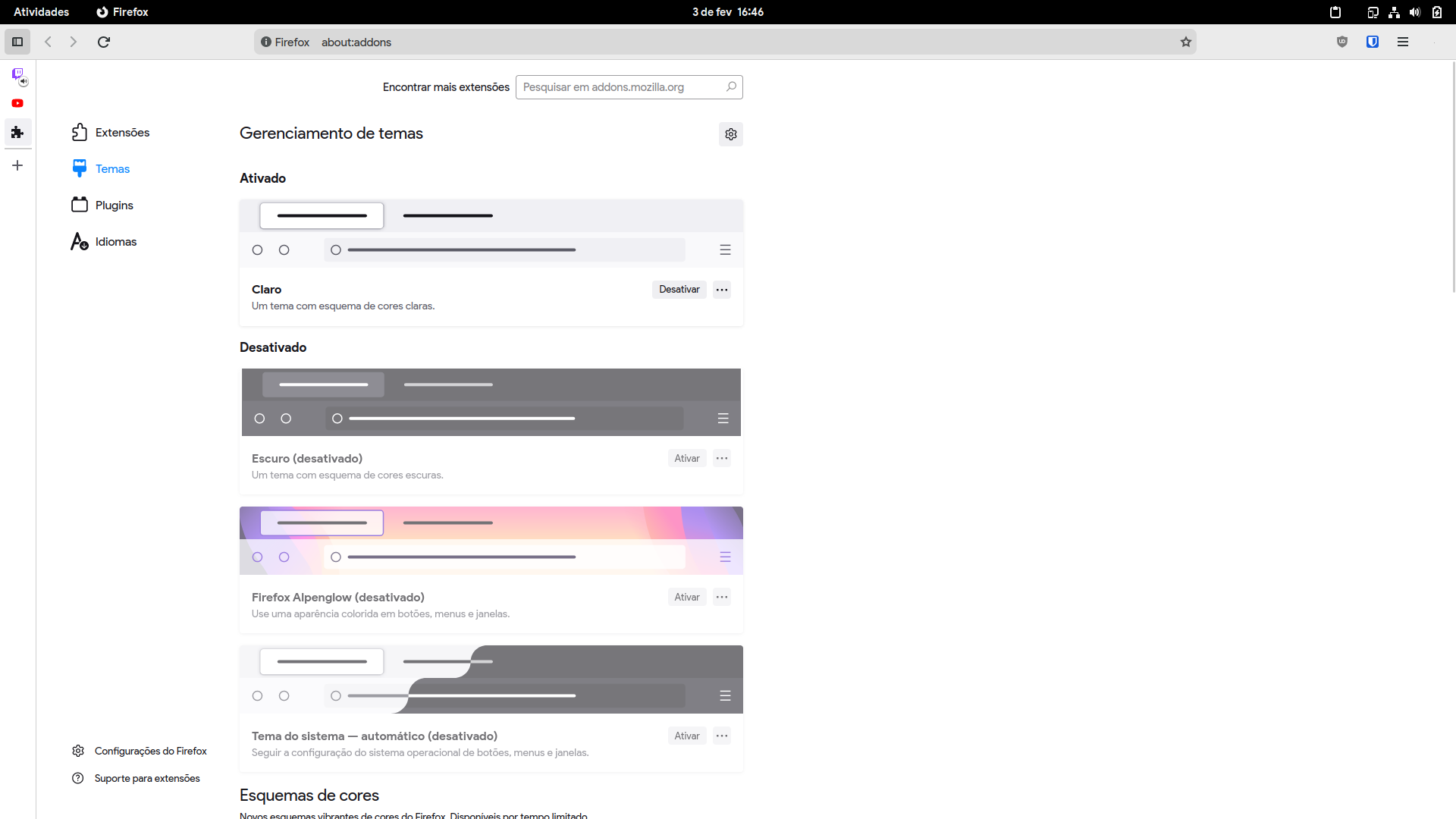
It always filled the corners whenever a window was maximized, but the rounded corners of the top bar were drawn over everything the desktop shows, like a GIMP layer that sits on top of every other one. Now that it is gone it just shows a the regular corners of the window, like this:

Awesome, thanks. Definitely looks somewhat more generic now, but it’s not as bad as I thought either, i.e. it definitely still has a recognizable aesthetic.
Looks nice. Plus, what Firefox CSS theme are you using?
Oh, it’s firefox-gnome-theme mixed with firefox-vertical-tabs. I usually use the dark mode variant, but switched to the light one for the screenshot for a better contrast.
Thanks.
Definitely worth it!


