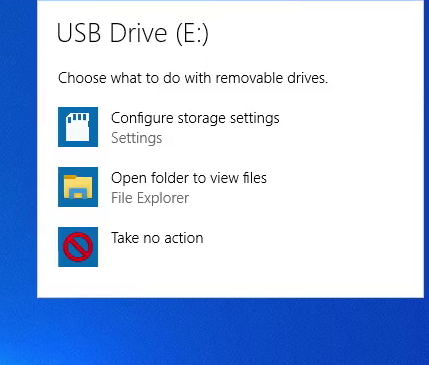
Layer 2 (Metro) is particularly annoying for me. I’m not using a tablet, this looks out of place:
Good point. This is the worst UI.
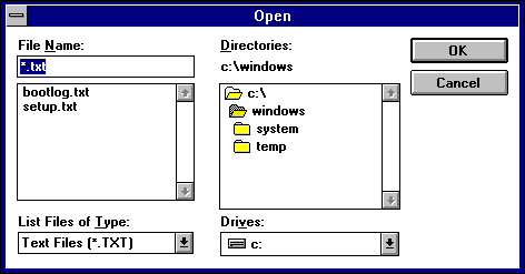
One thing that wasn’t mentioned in the post, but was mentioned in the comments is the directory picker from Windows 3.1 in the “odbc data sources” utility.
Windows 10: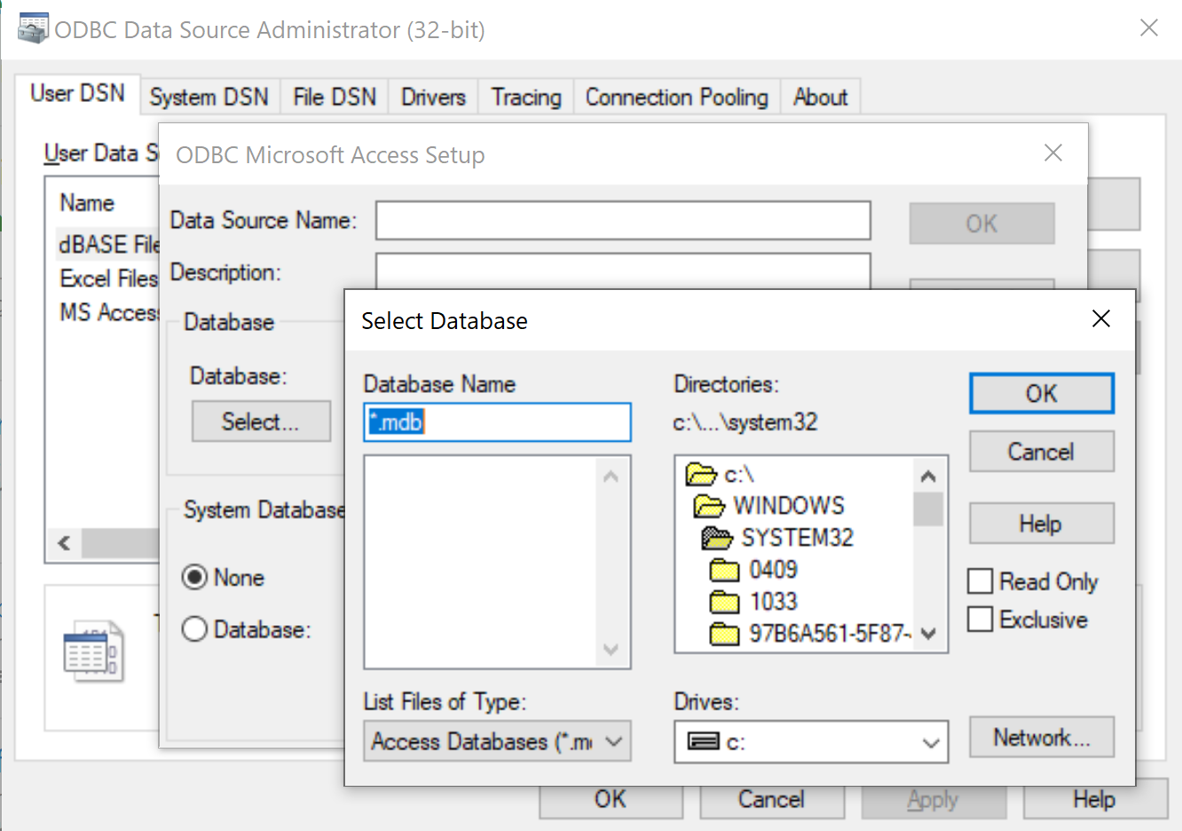
Windows 3.1:
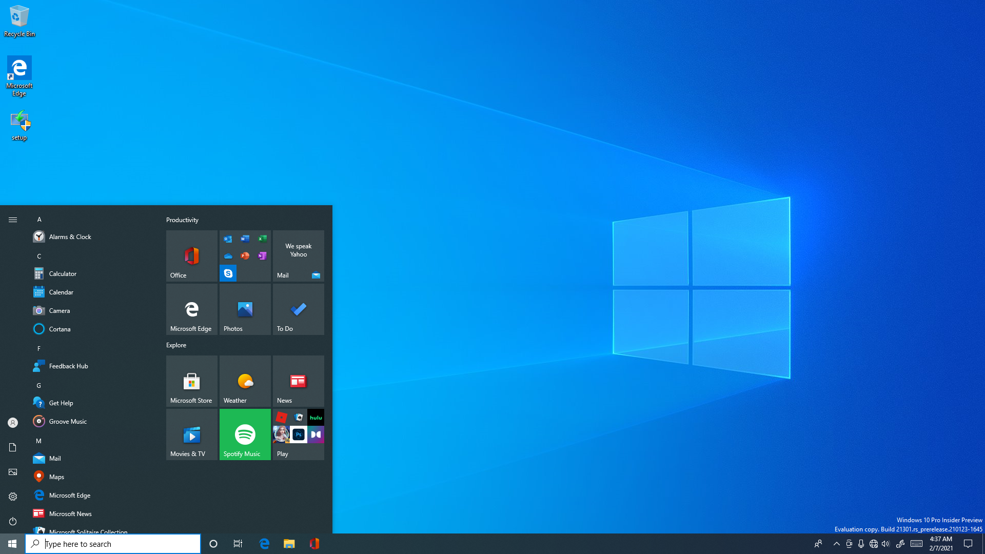
they should implement something similar to linux where themes are uniform throughout the OS. You have the “Dark” theme in Windows settings but it only affects the settings, windows explorer, and maybe a few more applications.
Although I agree that many UI elements were imported from previous versions, it is worth asking if it was necessary to change it or not. In my current version 21H1 few things coincide in their appearance with those shown in this article. Yes, certain UI elements are taken from even very old versions, but not at all identical in their operation, which was considerably improved, at least most of them. Besides, it is not very fair to talk only about the UI as it comes by default, without also adding the possibilities of configuring and customizing it, very broad in Windows 10, if you know a little, because the normal menus only show the basic settings, practically anything. Certainly what I can criticize is the current design of the control panel, which in Win7 was much more extensive and explicit, but with the achi-known good old God-Mode it can be more than supplied, since it is not used often anyway.