I’m not in the US but what makes you feel this is run down?
The ceiling looks incomplete with no wall and the color scheme is drab and dreary.
For large chains in the suburbs this is totally normal. They’re basically warehouses in a sea of parking lots filled with shelves and racks. Sometimes there’s carpeted areas in between the tile walkways or displays that go up high enough that it feels enclosed. For smaller or more urban stores, you don’t see this kind of construction.
You’re in a Walmart.
They claim to be cheaper so they can have that drabby distopian look.
In the good parts of town, they look nicer. In the poor parts of town they’re legit worse than that.
Fwiw, I’ll pay the extra dollar per shopping cart for the superior look of a target. Target is generally cleaner and crisper looking. As always there are exceptions to that rule.
Also the implication that countries outside the US don’t have dumpy stores is laughable. Europe’s got plenty of stuff like this, just usually not as large. Here in the Netherlands we have shops like Action and grocery stores like Lidl and they’re a shitshow inside most of the time.
Lidl in the US is definitely a step up from Wal-Mart.
Target has been going downhill. Lots of crap in the aisles now, and inventory is stocked during the day. It’s like shopping in a warehouse.
It’s incredibly difficult to find anything at Target, especially gender-neutral hygiene products since they hard-segregated hygiene into men’s and women’s. Just give me regular ass bar soap.
My partner was looking for coffee and looked all over the tea section and nope, naturally coffee belongs next to the liquor and red vines.
I hate going to Target, but I still take it over Walmart. At least I don’t feel dirty shopping at Target.Retail in general is hiring much less staff these days so they always look like shit. I heard on the radio that they are removing self checkout now too because of theft? I doubt they will increase staff back up to compensate. I kind of want to be there in rush hour the first time to watch the shit show.
The economics of removing self checkout are not there. You check 6 customers per attendant at self checkout - the store would need to lose $150,000 in merchandise at self check out per year to break even (assuming $30k/yr for the wage slave).
In a previous life, I did loss prevention. The average shrink rate in retail in the USA is 2%. That means 2% of the merchandise leaves the store without being paid for.
An average Walmart does millions in sales each day. Conservatively 2% of one million is $20,000.
Thousands of dollars of unpaid merchandise leaves a big retailer every single day. It’s part of the cost of doing business. That’s also why online retailers are cheaper. They don’t have to deal with external theft. They still have internal theft.
Shrink is the industry term. It’s merchandise that isn’t paid for and isn’t there when inventory happens. Theft is most of it, both by customers (external) and employees (internal). It’s also things that aren’t rang up right at the register, damaged merchandise that isn’t removed from the system correctly. It’s a big umbrella term.
It varies. My Target is exactly the same as it ever was.
That’s a Meijer
Wasn’t sure at first, but then I saw the mPerks sign.
deleted by creator
Fair enough. Those don’t exist anywhere near me. IMO blue = Walmart
Haha that’s my favorite opinion
Ugh. Target feels suffocating to me with all the red and the way everything feels like an end table covered in popurrí.
Welcome to Costco. I love you
The “unfinished” ceilings are common in warehouse stores. It is largely a feature of practicality. Since electrical, water and ventilation typical run overhead and needs to be serviced occasionally, putting drop ceiling tiles up would make them difficult to work with, particularly when you need a scissor lift (rather than a ladder) to reach the utility lines. But it also has some benefits like higher lighting fixtures which means less direct/more ambient lighting, fewer places for pests to roam in the building or dust to build up, etc. It may just be that I’m used to it, but it doesn’t bother me as an aesthetic. Drop ceiling is more common in smaller stores.
Not sure what you mean by the drab colors. The floor looks like it could be whiter and probably needs a polish, but the blues look nice enough to me. There’s not much to decorate though as most of the story is wide open with very few surfaces that aren’t covered in products for sale.
Pretty much anywhere you have overhead storage with forklifts, you’re going to not have a drop ceiling. Otherwise you’d just have people hitting the damn ceiling with the forklift. They already hit the sprinklers enough.
Yeah, I’m sure that is the primary reason.
Oh yeah, this is super standard. Honestly I had to scroll down to find what was even notable to you about this picture. I live in a major city and basically every store I go in to looks identical to this.
That’s not run down, that’s a warehouse. Is it falling apart? Is the flooring worn? Are the walls cracking? Ceilings leaking? That’s what run down means, not whatever your weird complaint is about the decor and color scheme is.
This is totally normal for Walmart to look like. It’s basically a warehouse with extra steps.
Ceiling design is intentional, it’s cheap and it maintains temperature much better than a drop ceiling or whatever else you’d want up there.
Walmart normally has skylights too to let in natural light but I can’t see any in the pic. That looks like a poorly maintained Walmart.
This isn’t a Walmart. It’s Mejer.
Yeah I knew it wasn’t walmart by the stuff at checkout not being the right color, but I’ve never seen a Mejer before. I take it they’re basically the same thing as malwart?
More expensive, has NFC, but essentially the same stuff as a Walmart.
Can you show us what you think they should look like?
Coz I’ve seen Americans, Australians, and Europeans call this normal looking. So I’d love to see what you think isn’t.
That’s just a default Walmart, unironically.
This isn’t a Walmart. It’s Mejer.
Huh, I thought Meyer was red, more like Target
You might be thinking of Fred Meyer, which is red.
Or Oscar Meyer which is a hotdog.
Or Lane Meyer who thought he was better off dead.
My bologna has a first name…
That ceiling is supposed to be that way. The insulation is on top of the roof deck, and the lack of a suspended ceiling gives it a more open feel. That’s why they painted all of the roof structure white (it also allows them to use less power for lighting). Walmart has a lot of problems, but store design isn’t one (although retail layout is, IMO).
We have a few of these warehouse type shops in the UK, Costco, Matalan, that sort of thing, it’s not styled like a high street shop would be.
My local Asda is like this, but they’re Walmart now. I’ve got a feeling that the Tesco is too, but I haven’t been for a while.
My Tesco Extra looks nice and has a ceiling with very cool lighting. Big local Sainsbury’s has a ceiling, but they should definitely improve cleanliness in some areas. And ASDA Superstore is a filthy mess. I try to avoid it, because it’s disgusting.
Yeah, the bigger supermarkets are too aren’t they? Like there’s some lovely supermarkets with nice styling, but they’re usually the little ones.
that’s pretty common for big box stores. they’re put up cheaply and the buildings are only rated to last 15 years in some cases.
deleted by creator
It’s a Wal-Mart so yeah, that’s normal.
It’s not a Walmart.
Even the worst store in Germany looks better than this.
I believe you but can you post a picture, I’m curious what they look like there.
…ok it’s not letting me respond to the poster I’m selecting so whatever the fuck
deleted by creator
deleted by creator
How is this mildly infuriating
It’s mildly infuriating because op doesn’t like the color scheme, therefore it’s “run down”
If you eat inflammatory foods every day, anything can be mildly infuriating
If this is “run down” I wanna see what you would consider normal.
So in other words “yes” 😁. Honestly the floors look clean, stuff is on shelves, I have no idea what OP is complaining about.
I assume they mean more like… Sterile? Walmart always puts me off by how cold and uninviting it is. Just a white warehouse with metal shelves, fluorescent lights, and linoleum floors. There’s no life to them like other smaller stores.
You had me zooming in looking for something. Like others have said, this is the “passing the savings along to you” look.
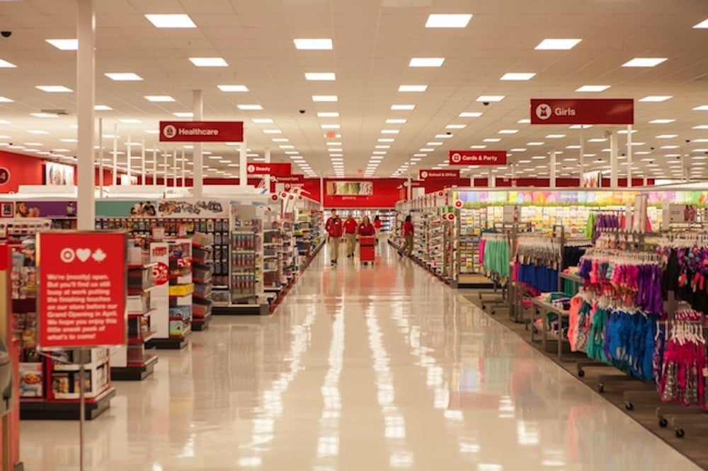
Target is a little more lively with an actual ceiling and brighter color scheme, but it’s really the same thing with a little extra polish.
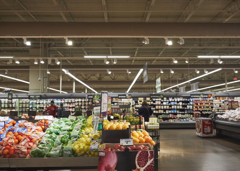
This is a Giant Supermarket. Same overall feel as the Walmart, but slightly less warehouse like to make things look more appetizing.
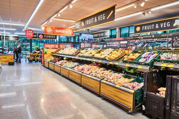
Aldi has done a pretty good job of remodeling. It’s a value brand store where just about everything is store label, and it used to look rougher than Walmart. Now it’s become almost trendy and chic, but prices are still good. Makes the others really look like penny pinchers.
A large part of it is probably stores are so big making it nice would be “cost prohibitive” since they’d require more cleaning and maintenance.
Aldi has really cleaned up it’s act in the last decade or so, but so have all the other grocery stores in my area. Customers want to have a luxury feel and passing along the savings really isn’t necessary if supermarkets syndicate themselves properly.
I love Aldi and it’s where I get 75% or so of my groceries. I enjoy cooking, so it’s easy to get basic quality ingredients there, and I’ll grab the occasional prepared food as a treat, especially during German week!
They’ve expanded their offerings and still manage a good price. We’ve gotten there ground bison and lamb and dinner frozen duck breasts that have all been great. I like their flake style imitation crab. They have some good seasonal offerings.
Their not having any name brands seems to help them beat the price collusion the other stores have. Giant has bought out most of the stores near me, which doesn’t help, but I buy little enough there I don’t complain much about it.
Seriously though, what’s wrong with them? Have I been living in a dump and not realizing it?
I’m really questioning that myself. I’ve been to all the stores I posted and they’ve always been fine.
I just looked up a Tesco and a Carrefour from Europe and they look about the same as the US stores, so I’m wondering where OP lives where box stores are beautiful.
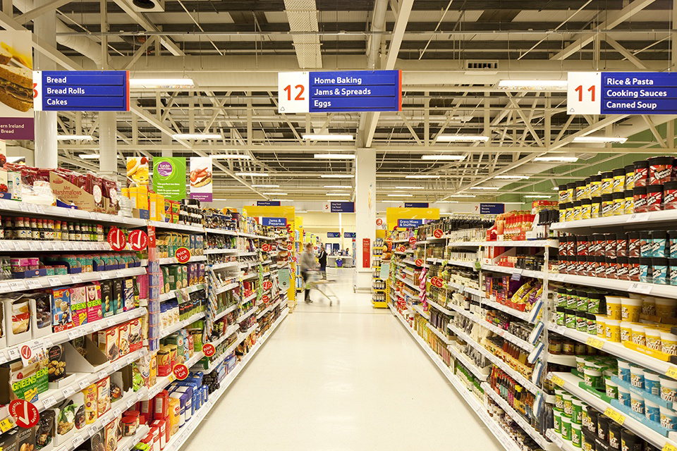

This is how most supermarkets (Walmart/Kroger/Target, etc.) in the U.S. look brand new - they’re effectively warehouses that sell product directly to customers. Smaller shops and boutiques have finished ceilings that hide the ductwork and such because they’re meant to be more flexible commercial/office space, but large stores like this do not, except for specialized locations like electronics, jewelery, or pharmacy, that can be gated off from the rest of the inside of the building for reduced operation and security.
Ignorant American here: what looks “run down” about it?
The big box store chain esthetic. Ostensibly about passing value onto the customer (we put a roof over the products, what more do you want?) but probably more about maximizing shareholder value.
In fairness from the perspective of someone who has had to pull a lot of network cable in buildings before, drywall ceilings SUCK, drop ceilings are fine but can really be a pain, and open ceilings are chefs kiss soooooo much easier to work with. I promise that’s true for your HVAC, fire sprinklers, electrical/lighting, and plumbing guys too. Particularly when you have to work on a scissor lift for those high ceilings, rather than on a 6ft ladder. From a practicality standpoint, open ceilings are way better for maintenance and new installations.
WDYM run down? Bro that looks really good.
Looks like a normal grocery store to me. If you want run down looking you should see what family dollar stores look like.
Or a K-Mart. Any of them.
LOL, what K-Mart? They’re (rightfully) long gone, at least from around here.
Apparently they are still around in Australia. They just had a Hamas related marketing snafu.
It was the first store I thought of but I haven’t seen one in years. The ones here made family dollar look good and Walmart look upscale.
Yeah dollar stores are the worst. They usually only have 1 or 2 employees and everything is everywhere. I don’t blame the employees, the store management needs to hire enough people to staff the fucking things.
Latest John Oliver on Dollar stores:
As a retail manager, it looks fine? If the people in front of you are all waiting to check out, they should probably grab people from other departments to cover a few extra registers for a bit, but the store itself looks nice to me.
Why open more registers when you can push people towards self-checkour? As a retail manager you should be trying to get your customers to work for you for free whenever possible.
I don’t know anyone that actually thinks like that at store level.
Somebody at some level is definitely thinking that way.
Could probably be me being ignorant, but how does this look “run down” exactly? It looks like a Walmart, and them looking like this is not strictly a US thing. Walmarts look exactly like this in Mexico too, and from what ever little I seen of em, also look the same in Canada.
But to answer your question, no. Not all shops in the US look have the Walmart look.
Boy oh boy. Go to some of the save-a-lots in Cleveland OH. You’ll see the “run down” feeling. It’s just supposed to be the cheapest store to buy stuff, which makes sense they don’t go all out
DAE Murica sux? XDXDXD
deleted by creator
Who called the comment police?
Be nice.
Jesus Christ. Just be nice.
Why is no one on Lemmy nice.
You should delete this comment and post something more helpful.
Im generally only rude when someone posts a low effort dig at my country or when someone attempts to dictate how I should act
If you think this is run down, check out John Oliver’s recent piece on “dollar stores” in the US
This can’t be a walmart in america, where are the 50 american flags?
It’s not, it’s a Meijer (Midwest chain).


